Capstone Project: Life Expectancy and GDP Data
Here is my first #DataScience post! It visualizes the data with respect to Life Expectancy, GDP and Country in various ways. All the data visualization was done by me as I complete my #Codecademy boot camp during quarantine!
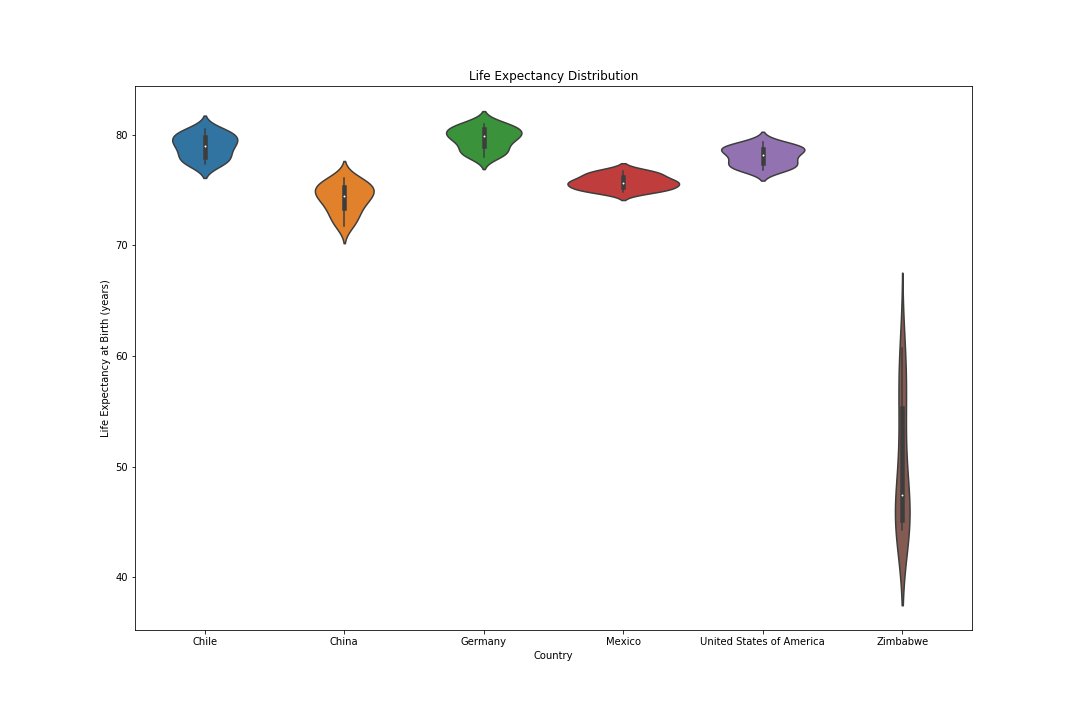
This first graph is a violin plot that shows the distribution of Life Expectancy at Birth by Country. It is what you would expect, where the further developed countries have a much higher average life expectancy than the Zimbabwe.
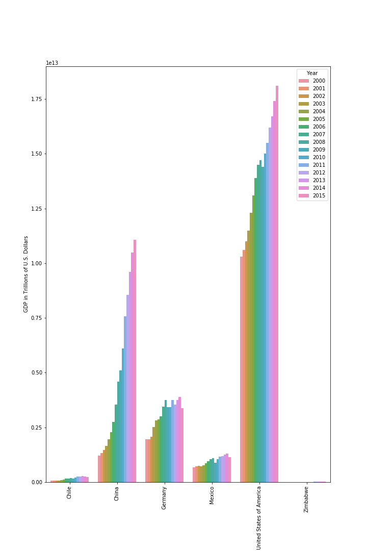
This bar graph shows the GDP by Country and the years are distinguishable by color. This graph tells us many things, but most importantly that LE (life expectancy) is not directly correlated with GDP. Chile which has a significantly lower GDP than China has on average higher LE.
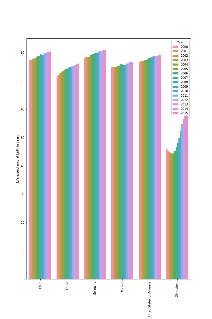
This graph shows the LE by Country, supports the fact that GDP is a correlation of high LE not a causation. Other factors such as culture, diet and lifestyle can be said to have a more of a causation effect than GDP. Ie. China has a massive spike in GDP but a tiny increase in LE.
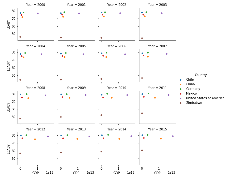
This facet grid scatter plot shows how several low GDP countries top LE scale. Zimbabwe can also be clearly shown climbing the LE scale while staying relatively in the same GDP range.
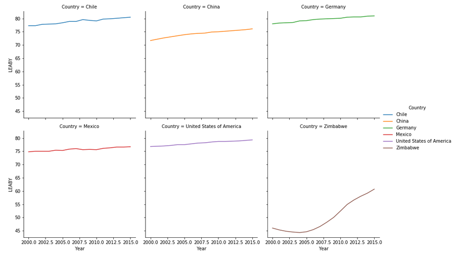
This facet grid line graph displays LE over years. Looking at the data so far, one might think that there is a minimum level of GDP that causes high LE. So as Zimbabwe approaches this level, LE will skyrocket.
DS Life Expectancy
This first graph is a violin plot that shows the distribution of Life Expectancy at Birth by Country. It is what you would expect, where the further developed countries have a much higher average life expectancy than the Zimbabwe.
This bar graph shows the GDP by Country and the years are distinguishable by color. This graph tells us many things, but most importantly that LE (life expectancy) is not directly correlated with GDP. Chile which has a significantly lower GDP than China has on average higher LE.
This graph shows the LE by Country, supports the fact that GDP is a correlation of high LE not a causation. Other factors such as culture, diet and lifestyle can be said to have a more of a causation effect than GDP. Ie. China has a massive spike in GDP but a tiny increase in LE.
This facet grid scatter plot shows how several low GDP countries top LE scale. Zimbabwe can also be clearly shown climbing the LE scale while staying relatively in the same GDP range.
This facet grid line graph displays LE over years. Looking at the data so far, one might think that there is a minimum level of GDP that causes high LE. So as Zimbabwe approaches this level, LE will skyrocket.
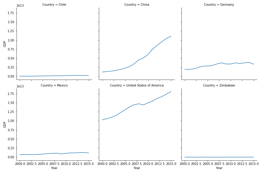
However, this facet grid of GDP over years shows disproves that theory pretty quickly. Chile has a very similar GDP level to Zimbabwe but one of the highest levels of LE. Perhaps its geography, disease and other factors that influence LE to a greater degree than GDP.
DS Life Expectancy
Comments
Post a Comment